Kindling
A mood-led commerce website guiding product discovery through story, feeling, and interface.
I turn complex systems into clear stories through product design, interaction, and visual systems.
View work ↓A wellness app built around small check-ins, circles, and social nudges. The product reached an approved beta after Apple review.
View live product →A mood-led cannabis commerce concept that helps people understand products before choosing what to buy. The linked site is a showcase version; the current original site has changed.
View showcase →A working narrative prototype for AI insurance infrastructure, built with React, Three.js, GSAP, and Vite. The original site is no longer live; I created the linked showcase version.
View showcase →After an initial direction was rejected, the experience used an animated potato to connect the family story, product benefits, and recipes. The revised direction was approved.
View site →A regional identity built around the Pacific Northwest, with a logo, palette, typography, and applications documented in the brand book.
View brand book →An identity system for renewal, connecting trees, mountains, and ocean into a shared visual language for the team.
A private ChatGPT and Codex workflow experiment for source checks and human approval in research-heavy decisions.
Request proof →
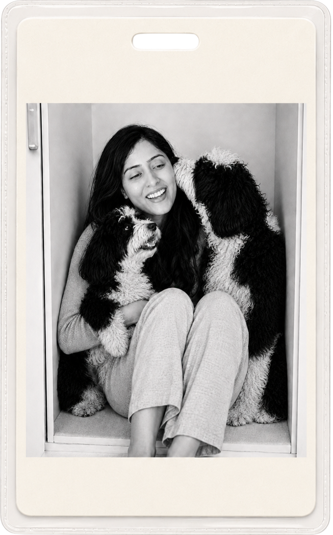
I’m drawn to ideas that are complex, emerging, or not fully formed yet. My work spans AI products, enterprise platforms, e-commerce, brand systems, and consumer experiences, but my approach stays consistent: understand the whole picture, find the underlying structure, and shape it into something clear, thoughtful, and distinctly human.
I believe every product has a story. Finding that story helps me connect the individual pieces and create experiences that feel intentional, not just functional.
That curiosity continues beyond my professional work. I enjoy building products of my own, exploring new tools, and bringing ideas to life through design, technology, and storytelling.
I’m based in Bloomington, Illinois, where I spend my quieter hours reading and creating stories inspired by life with my puppies, Krypto and Luna.
Download Resume ->
A focused archive of product experiences, brand systems, interaction design, AI-assisted workflows, and story-led interfaces.
A mood-led commerce website guiding product discovery through story, feeling, and interface.
A website for an AI-led insurance platform, shaped through systems, interface design, and narrative.
A playful digital experience connecting product storytelling, family moments, and everyday utility.

An interactive walkthrough of a Dravidian-inspired complex, designed around spatial storytelling, atmosphere, and the quiet drama of architectural form.
View Project ->From campaign identities to visual systems, this work explores how story becomes structure - through typography, motion, interface details, and the small moments that make a brand feel alive.
A brand that doesn't just look like the Pacific Northwest. It belongs there.

The work was not to make a mark look energetic. It was to give renewal a form.
Personal builds and workflow experiments where I explore product behavior, emerging tools, and systems I want to understand by making them.
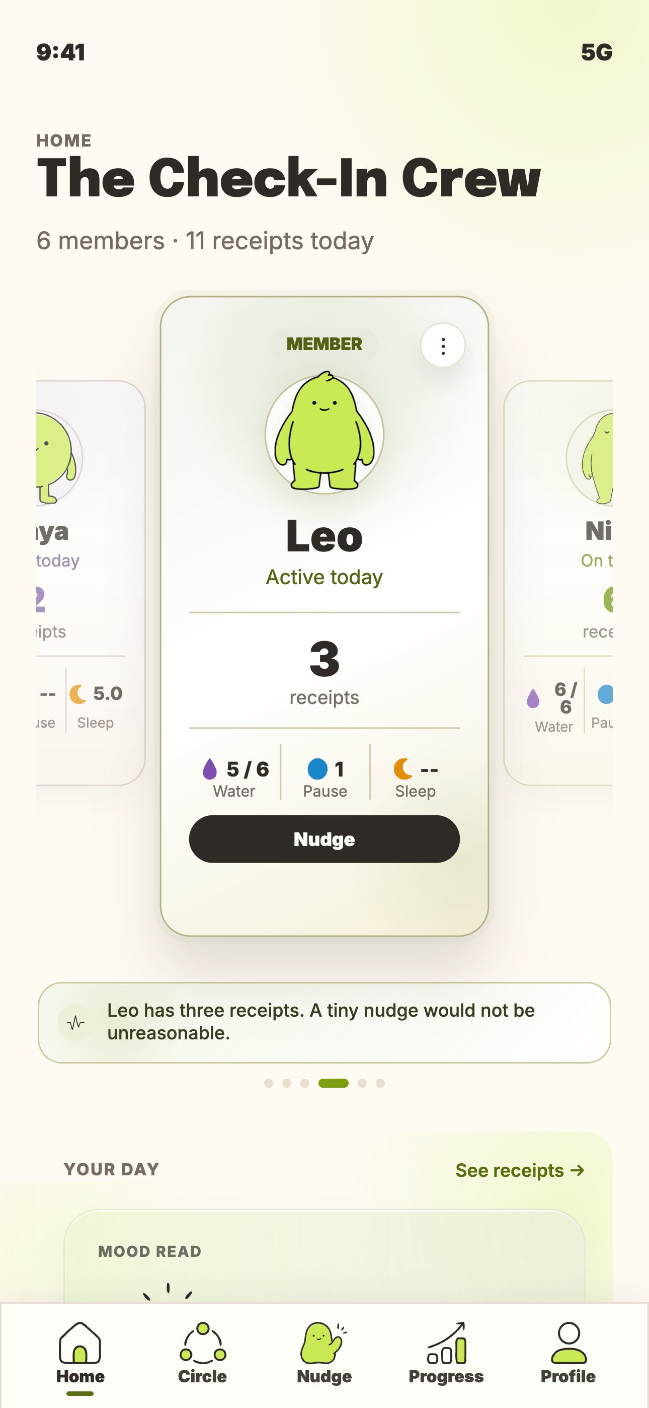
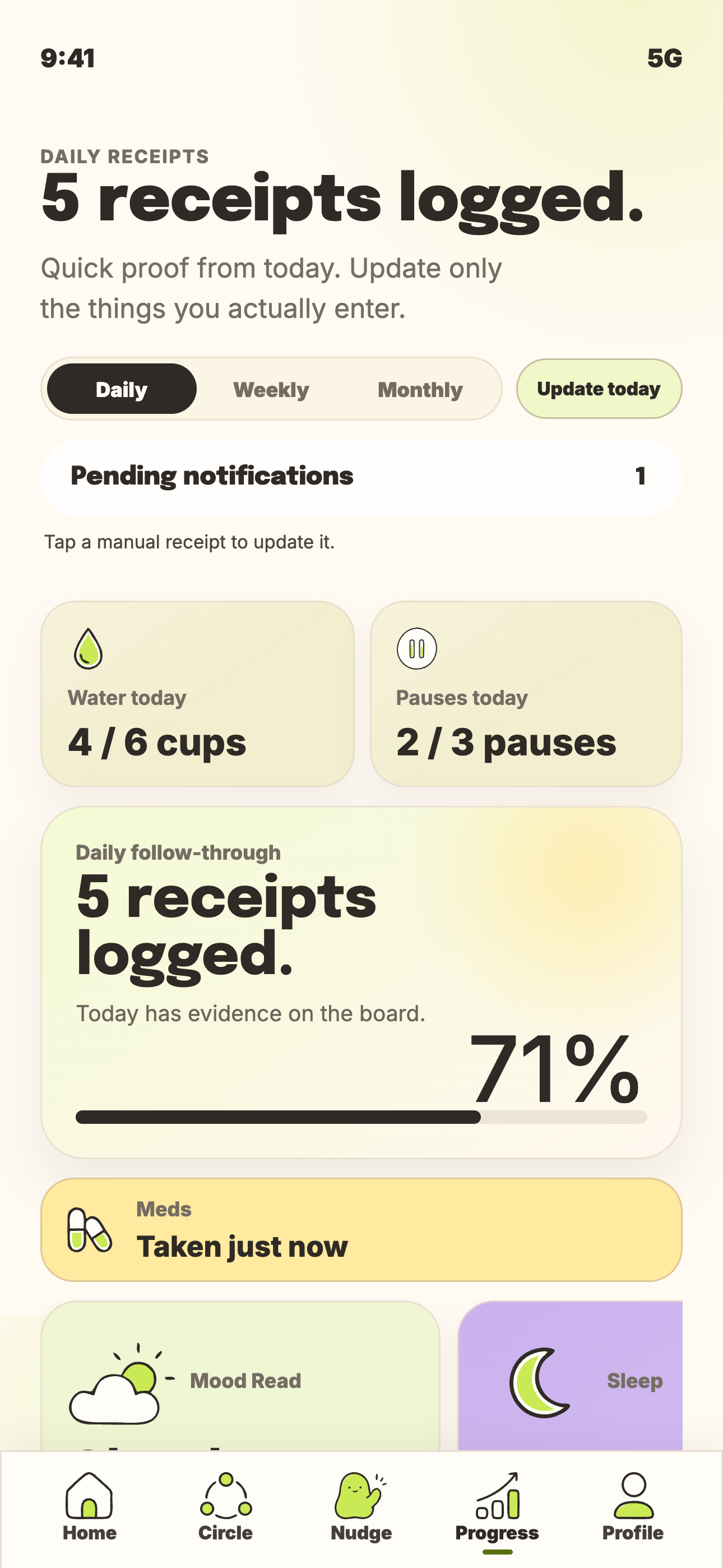
A beta product using small check-ins, circles, and social nudges to help wellness routines feel witnessed.
View case study ->A private ChatGPT + Codex workflow prototype for evidence checks and human approval gates.
Private repo on request ->A wellness app built around care, humor, and tiny social accountability instead of guilt-based reminders.
A beta wellness app built around a sharper idea: people do not just need tracking. They need motivation that feels close, funny, and safe to receive.
Private conversations were summarized into design direction, not published as raw research.
People already had apps that could record workouts, water, moods, and routines. The missing piece was emotional: a reminder often feels like pressure when it arrives without context or care.
In conversations, people often talked about being inspired by someone close to them: a family member or friend who kept showing up. That shifted the product from solo tracking to small circles of encouragement.
The product could not sound like corporate wellness. It needed to be funny, specific, and affectionate: a nudge that teases the behavior without shaming the person.
The voice can be deadpan, but never insulting. No body shaming, no guilt spiral, no torment. The joke is about the tiny task, not the human trying to do it.
Water exists. Bold of us to mention it.
Ate something green. Nature has been notified.
Your legs appear to have a meeting outside.
A tiny workout still counts. Annoying, but true.
Your bed has submitted a formal request.
Future you would like one boring win.
Tiny pause. The world can survive it.
Mood check. One tap. No essay.
The app needed to feel warm without becoming childish, funny without becoming careless, and social without becoming pressure. The system gave every screen the same rule: calm base, clear action, no-shame behavior cues.
Base colors keep the daily surface quiet. Mood colors make tracked habits legible at a glance. Display type gives the brand a little strangeness, while product text stays plain enough to read quickly.
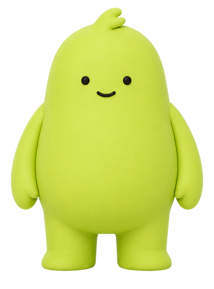
The blob mascots made the experience lighter and more memorable. They gave check-ins a small emotional lift without making the product feel childish or clinical.
Home, progress, nudges, and circles had to work together so a friend or family member could notice the effort and send a tiny push with care.
What looked like a few screens became routing, data states, profile visibility, circle behavior, progress surfaces, and device-specific QA.
The first Apple launch came with review friction, fixes, and uncertainty. The outcome was not just a prototype: it became an approved beta.
A private ChatGPT and Codex workflow prototype for evidence checks, review gates, and human-owned decisions.
A private workflow experiment using ChatGPT and Codex to turn messy source material into evidence-checked, human-approved decisions.
The point was not to let AI run ahead. It was to design a workflow where AI could collect, compare, and draft quickly while the final judgment stayed visible and human-owned.
Every useful output needed a source, a reason, and a review path. If the workflow could not explain where a recommendation came from, it had to stop instead of sounding confident.
ChatGPT and Codex supported the repetitive parts: reading, summarizing, comparing, drafting, and checking. The system kept the authority layer separate: approve, reject, revise, or escalate.
The important design move was making the review surface explicit: what changed, why it changed, what evidence supports it, and what still needs a human call.
Capture requirements, context, and source material before drafting starts.
Summarize, compare, flag gaps, and propose next steps.
Accept, edit, reject, or stop before any sensitive action.
The workflow was designed to escalate uncertainty rather than hide it. Missing evidence, unclear requirements, sensitive fields, and irreversible steps all become review moments.
The output was never just a generated draft. It was a packet: source-backed reasoning, decision notes, gaps, and a clear boundary around what had not been approved.
I designed the workflow logic, prompt structure, review checkpoints, escalation rules, and output format so AI could assist without becoming the decision-maker.
This exploration shows how I use AI as a supervised capability: define the job, constrain the risks, check the evidence, and keep the human decision visible.
A website for an AI-led insurance platform, shaped through systems, interface design, and narrative.
A website for an AI-led insurance platform, shaped through systems, interface design, and narrative.
The first site had strong visual moments, but it still behaved like pages of product content. For AI insurance infrastructure, that meant people had to understand the industry before they had a reason to care.
The redesign became a system story instead of a product brochure: pressure, fragmentation, intelligence, connection, then demo intent.
Particles felt right, but early tests would not hold shape. They looked atmospheric, not intentional, until the motion was anchored to invisible 3D forms.
Once the particles could gather, fragment, rain, grow, and reform, one material could carry the movement from calm systems to pressure to adaptive intelligence.
The hard part was making it feel like a page turner, not a storybook. Each beat needed movement and consequence so people would keep following the system.
LIZ came after the metaphor had done its work. By then, the product could feel like the logic behind the transformation, not another AI feature block.
The interface could not behave like ordinary SaaS chrome. Rails, pulses, cursor behavior, sound, and CTA cues had to guide people while staying inside the world.
The final site was not a static concept. It was built with React, Three.js, GSAP, and Vite, then deployed on Vercel and tuned across desktop, tablet, and mobile so the story could lead to booking a demo.
The lesson I carried forward: design is not only about what an audience will like. It is about what they can understand.
I had to understand insurance, AI, infrastructure, and why the product mattered before I could make it legible for anyone else.
The outcome was a working narrative that gave people a reason to stay long enough for the product to make sense.
A mood-led commerce website guiding product discovery through story, feeling, and interface.
How do you turn a stigmatized, confusing product into a guided experience people can trust?

Most cannabis commerce still felt dark, clinical, or hard to trust. A softer redesign made Kindling feel warmer and more approachable, but people still hesitated because they were not sure what they were buying.
The problem was not only stigma. It was uncertainty. If someone did not understand mood, format, strength, or fit, a beautiful product card would not make them ready to buy.
Strain names, THC percentages, and formats were useful, but they assumed the user already knew the category. The exploration shifted toward how someone wanted to feel and how much guidance they needed.
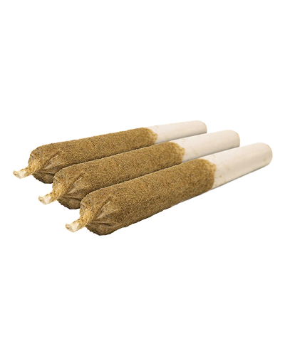
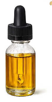
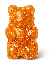
Move, Dream, Chill, Happy, Groove, and Harmonized became a softer way to enter the category. The goal was not to hide the product, but to make comparison feel understandable.
A pale blue drawn from still water, chosen to slow everything down.
Updated daily based on what our community is loving most.
Mood shelf→
Members: $21.99 | $24.99

Members: $28.99 | $32.49

Members: $23.49 | $26.99
Members: $16.99 | $19.99
Updated daily based on what our community is loving most.
Mood shelf→
Members: $18.99 | $21.99
Members: $24.99 | $29.99

Members: $31.99 | $36.99
Members: $12.99 | $15.99
Updated daily based on what our community is loving most.
Mood shelf→
Members: $27.99 | $31.99
Members: $23.49 | $26.99
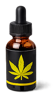
Members: $19.99 | $24.99

Members: $17.99 | $20.99
Updated daily based on what our community is loving most.
Mood shelf→Members: $21.99 | $24.99
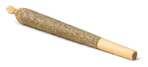
Members: $16.99 | $19.99
Members: $23.49 | $26.99

Members: $8.99 | $10.99
Updated daily based on what our community is loving most.
Mood shelf→Members: $16.99 | $19.99
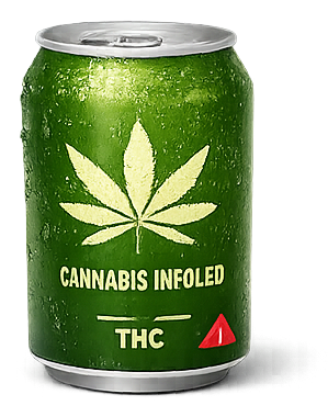
Members: $8.99 | $10.99
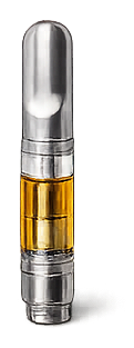
Members: $34.99 | $39.99
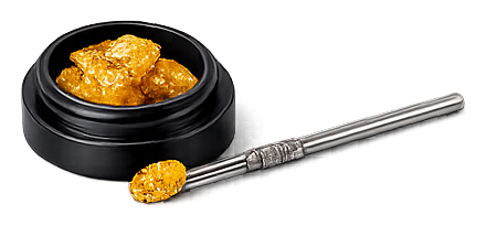
Members: $37.99 | $42.99
Updated daily based on what our community is loving most.
Mood shelf→Members: $28.99 | $32.49
Members: $19.99 | $24.99
Members: $18.99 | $21.99
Members: $27.99 | $31.99
Updated daily based on what our community is loving most.
Mood shelf→Members: $21.99 | $24.99
Members: $8.99 | $10.99
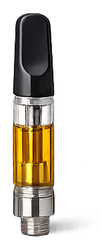
Members: $34.99 | $39.99
Members: $16.99 | $19.99
If the site only taught, people could leave without buying. If it only sold, people could leave confused. So products stayed near the learning moments, appearing after mood, format, or occasion gave the choice context.
Beginner paths, occasion-led browsing, categories, and shelves gave the experience structure. The user could explore without feeling lost, while the buying path stayed visible.
Slow your pace before you begin. This isn't something to rush into. Let your body lead, not your expectations.
Recommended
Baked Bliss Cookies
$32.99
Recommended
Sunset Gummies
$28.99
Begin with a low dose, especially if you're new. You can always take more, but not less.
Edibles take time. Give it at least 30-60 minutes to fully settle in.
Best experienced in a calm, comfortable space where you do not need to be on schedule.
Let the effect build naturally. The experience is gradual, not instant.
The original website launched in 2022. Its final experience did not end at a product grid. It offered mood-specific guidance, recommended formats, and practical next steps.
In a category where people feel unsure, design has to reduce the emotional cost of deciding before asking someone to buy.
A playful digital experience connecting product storytelling, family moments, and everyday utility.
The challenge was not how to explain potatoes. It was how to make Little Potato feel like it belonged in every home.
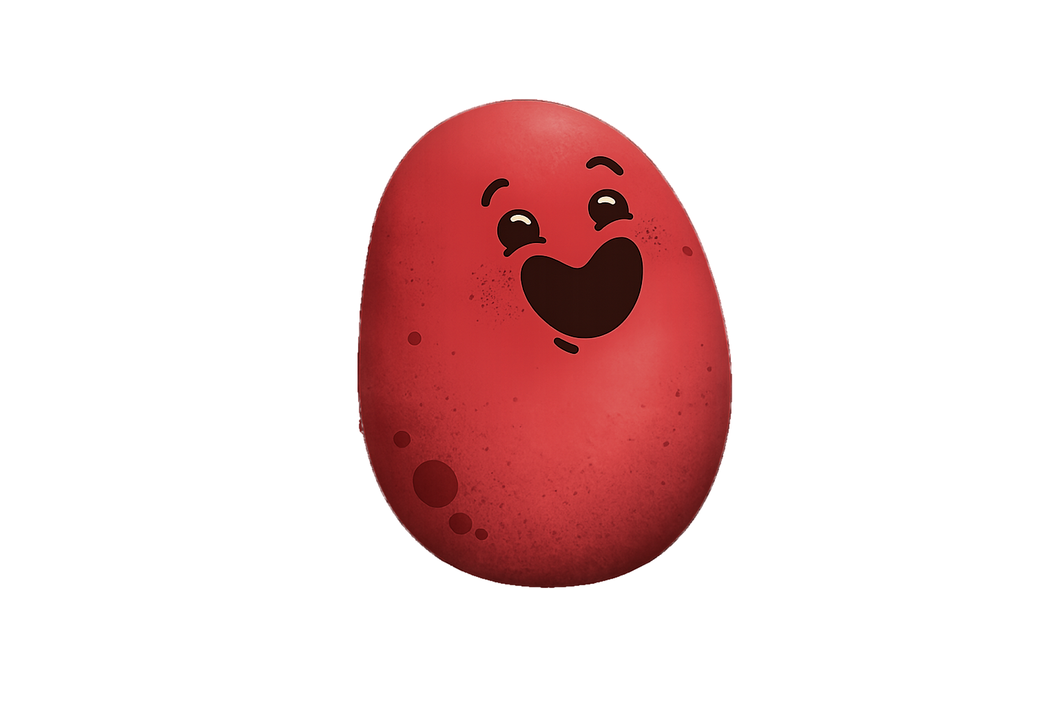
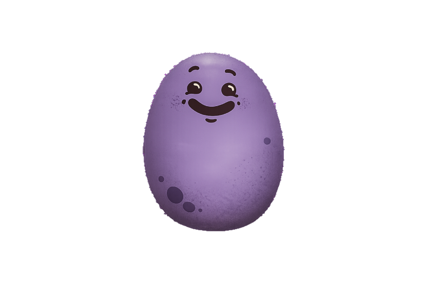
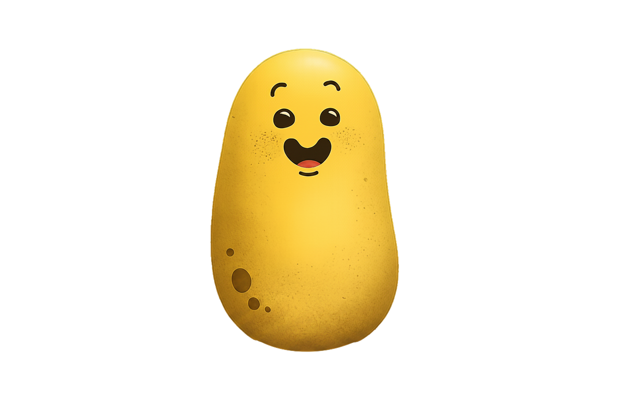
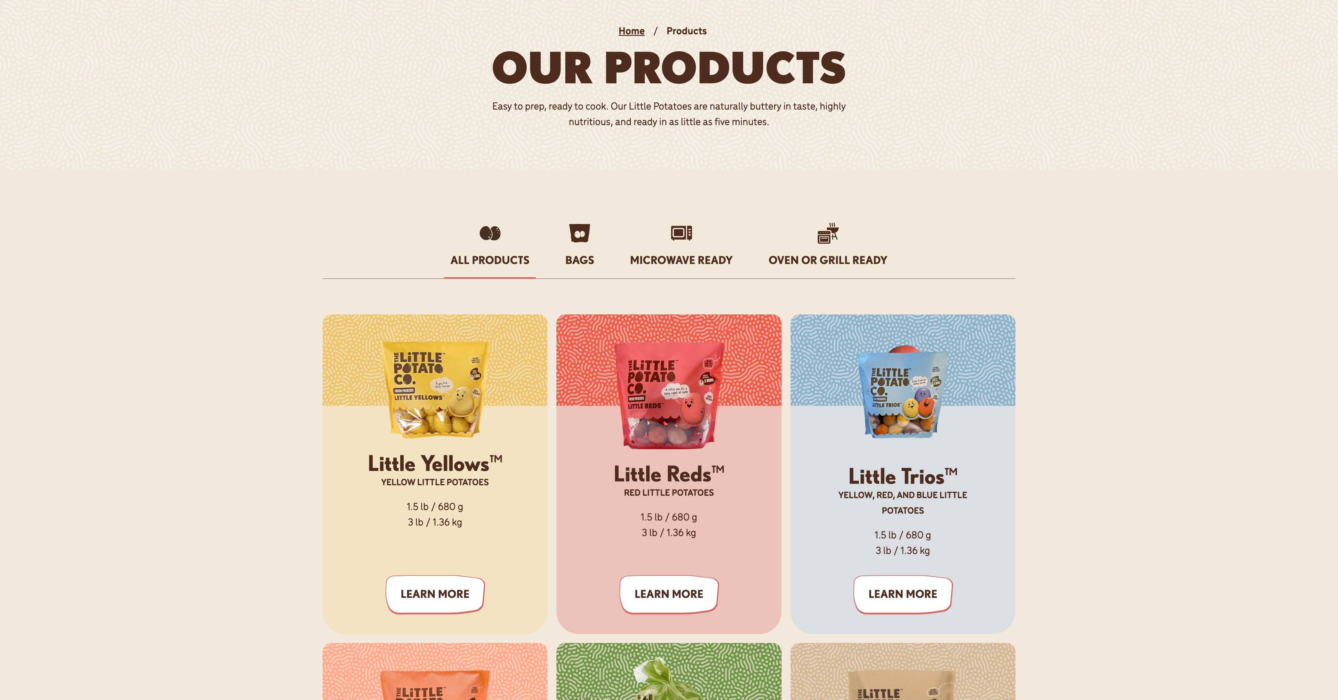
Potatoes were already in the house, but people were not thinking about branded potatoes. The work had to make Little Potato feel less like another grocery item and more like something that belonged at the dinner table.
The first direction leaned on product benefits: easy to cook, no peeling, no washing, fast enough for busy families. Those truths mattered, but they did not create a reason to care.
The client rejected the first pass because it felt run-of-the-mill. If the experience did not feel special to the people closest to the brand, it was unlikely to hold a shopper's attention either.
The breakthrough was to make the potato active. It could guide the site, introduce the family, explain what made the product easier, and keep the experience playful without losing the practical reason to buy.
The potato was not decoration. It became a character with a job: make the family's life easier, make dinner feel lighter, and make the brand feel like it had a place in the home.
The site also had to show who grew the product. That made the brand feel human before asking people to buy.
The utility stayed visible: quick prep, no cleaning, no peeling, and a product that could help a busy parent put something tasty on the table.
Recipes turned the idea into a habit. They gave people more than a reason to try Little Potato once; they gave them a reason to bring it back into the week.
The rejected direction clarified what was missing. The client did not only need benefit messaging; they needed a brand idea that could carry the site, the product truth, the family story, and the recipe experience together.
The site launched. The finished work by Major Tom and The Little Potato Company later won two Gold w3 Awards in 2023: Best User Interface and Food & Beverage (General Websites). Award announcement
A regional identity system for ecomm Northwest, built to feel rooted in place without becoming a Pacific Northwest cliche.
A regional identity system for ecomm Northwest, built to feel rooted in place without becoming a Pacific Northwest cliche.
ecomm Northwest was a community for founders, operators, and marketers driving ecommerce growth across the Pacific Northwest. The question was not how to make it look outdoorsy. It was how to make the brand feel rooted, useful, and local without falling into regional cliche.
The system had to hold two ideas at once: the grounded character of the Northwest and the sharper intelligence of a business community. The work became less about scenery and more about belonging.
Northwest grounded. Resilient. Practical insight. Real.
Sophistication comes from restraint, not decoration.Truthful. No-BS. Applied knowledge. Tactical, not theoretical.
Clarity is respect. Progress comes from sharing, not posturing.Collaborative spirit. Celebrate people. Intentional community.
Not connection for connection's sake, shaped by shared values.Dynamic wit. Light, rhythmic. Perpetually curious. Momentum.
Movement is how people connect, explore, and remember.
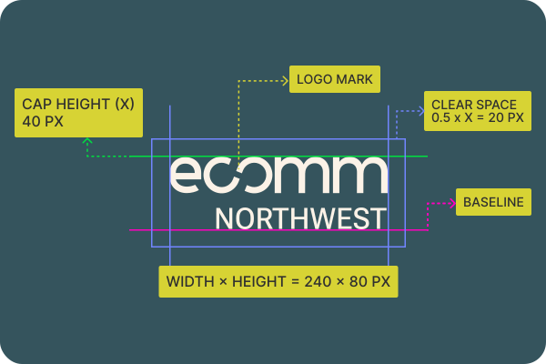 Linked mark / community signal
Every color was pulled from the Pacific Northwest landscape: soil underfoot, timber overhead, the yellow-green lichen that grows on rocks. These were not decorative brand colors. They were field notes.
The linked C and O were not a symbol bolted onto the logo. They were the wordmark: a small structural gesture for collaboration, shared progress, and the community at the center of the brand.
Epilogue, Source Serif 4, and Red Hat Mono gave the identity range: direct headlines, clear body copy, and a technical utility layer for commerce operators.
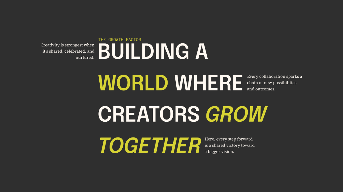
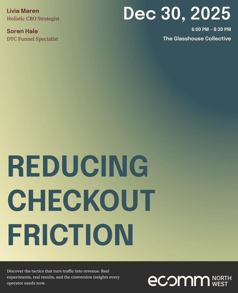
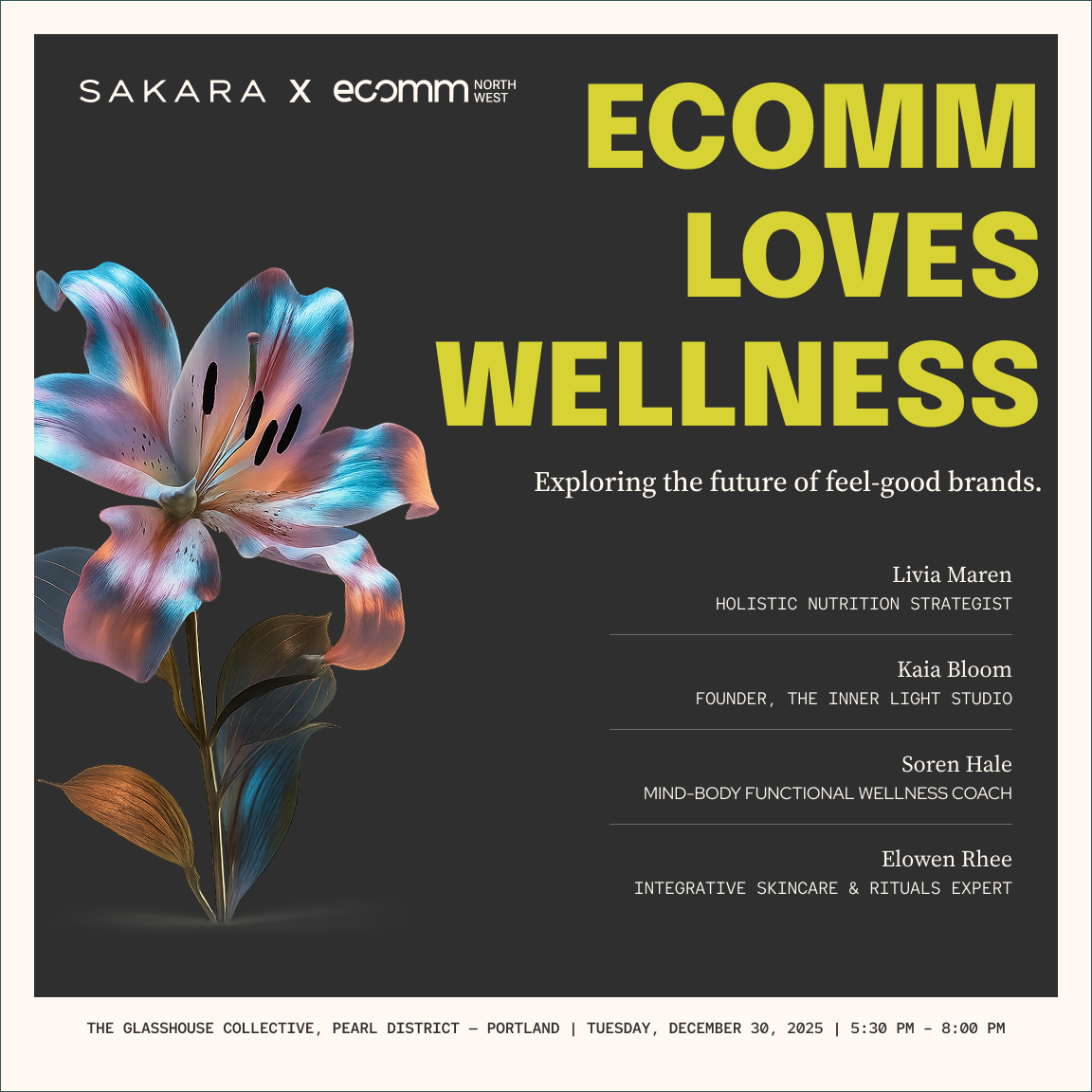
I defined a voice that speaks to founders like a peer: clear first, practical throughout. These two event posts explore visual range within the same brand system.
"Stop guessing your ad spend. Start with this 5-minute check."
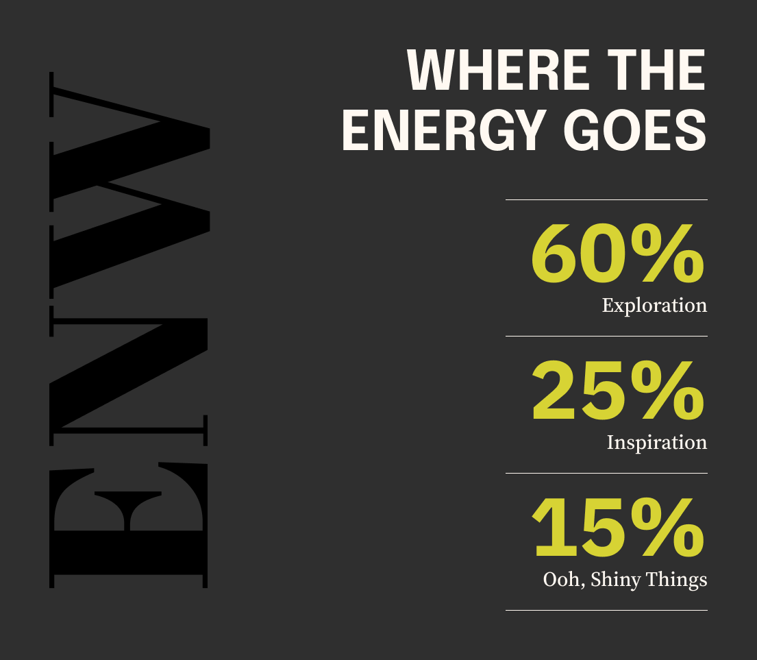
The identity needed to work beyond a static logo. Social layouts, type moments, and card systems showed how the brand could speak with the same regional intelligence across everyday touchpoints.
The identity went live in 2025 and is in use today. Its hardest test was staying rooted without becoming rustic: every color, type choice, and application had to feel like it could only have come from here.
The work was not to make a mark look energetic. It was to give renewal a form.
The work was not to make a mark look energetic. It was to give renewal a form.
The identity needed to give the team a shared language for what they were becoming. A professional mark could look polished, but it would not create momentum unless people could see themselves inside it.
Air, land, and ocean already shaped the work. Sri Lanka's landscape became the clearest way to express harmony, movement, and growth without making the campaign feel generic.
Spark and sun gave renewal a new-dawn feeling.
Trees and mountains carried resilience, ascent, and discipline.
Ocean rhythm connected the system into continuous force.
The team could recognize land, work, and self inside the mark.

Passion was expressed through resilience, collective growth, and the strength that comes from rising together.
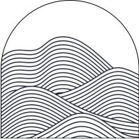
Position became a climb: strategic height, determination, and the confidence to lead from a stronger vantage point.
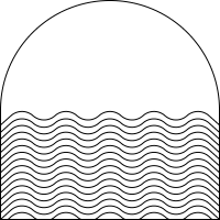
Pride became collective force: deep, continuous, and connected to every movement of the organization.
Passion, Position, and Pride were not pasted onto symbols. The symbols were chosen because they already carried the values visually and culturally.
The final identity worked because every expressive choice had a reason: warmth, strength, movement, and belonging all pointed back to the same renewal story.
The strongest idea was not only the final logo. It was the chain of reasoning that made the final logo feel inevitable.
A generic growth symbol could look professional, but it would not feel owned.
The landscape gave the identity memory, place, and emotional specificity.
Symbols had to carry values before the full mark appeared.
The reveal matters because the viewer understands what every part is doing.
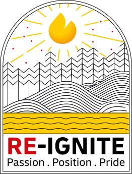 Primary · Color
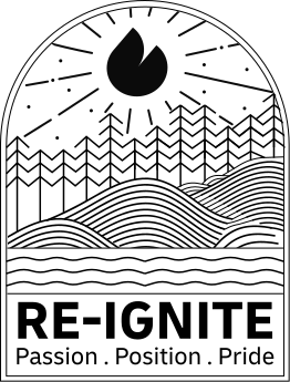 Primary · Black
 Secondary · Color
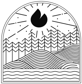 Secondary · Black
Once the symbolic logic was established, the identity could appear as a practical logo system: primary and secondary, color and black, without losing the story inside it.
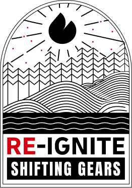
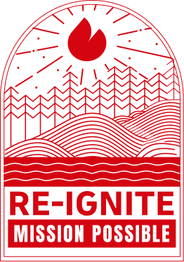
The identity has been in use since 2024. It began as RE-IGNITE: Passion, Position, Pride, then evolved through annual campaign updates: Shifting Gears in 2025 and Mission Possible in 2026.
The landscape mark carried forward as the annual theme changed. Each edition kept the recognizable structure while giving that year's message its own treatment.
Product experiences, brand systems, and AI-assisted workflows shaped through structure, interaction, and story.
Clear systems, careful visual language, and interfaces built for use, recognition, and momentum.